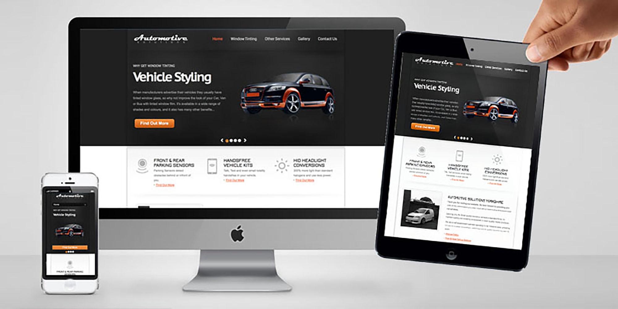
Responsive Website Design (RWD)
Sometimes known as RWD, these are websites designed to offer an optimal viewing experience for different displays and screen sizes.

Sometimes known as RWD, these are websites designed to offer an optimal viewing experience for different displays and screen sizes. This keeps control of the website look and style across multiple devices while making it easy to read and navigate. The idea is to build the site so that on smaller devices there is minimum of resizing, panning, and scrolling. Typical platforms range from but not limited to mobile phones, tablets, phablets, laptops, desktop computers and all their different orientations.
There are endless new resolutions and devices and to create a mobile website / version for each resolution and new device is now impossible, or at least very impractical. Responsive Website design and development is an approach that responds to the user’s behavior and environment based on screen size, platform and orientation not a fixed layout.
As more and more big blue chip companies get on the band wagon, the average user is becoming more expectant of a certain type of website experience, and statistics show if someone experiences even a small amount of frustration they will quickly move on.
One of Googles most recent updates now recognises a responsive website and ranks them higher in comparison to a website without responsive design. Have a look at your current website Google analytics and fine out how many of your current customers and users visit your site from mobiles & tablets. In my experience (depending on the industry) it’s around 40%, that is quite a lot of users that you could be loosing or frustrating.
As this is not a technical guide I’ll keep this super basic…
There are a few ways of approaching RWD, and I personally use a mixture of the following. Instead of saying this menu bar is 300 pixels wide I’d say its 60% of the screen width. The other trick is to say “if the screen is smaller than X but bigger than Y, I would like the menu font size to be 12” HOWEVER “if its smaller than Y I would like the font size to be 10”.
This is it in its most basic form, but you may have noticed that on a phone, tablet or other small screen sized devices that a website menu completely changes to a dropdown style. This is the same sort of code but in a more advance form.
I personally don’t recommend a ‘retrofit’ approach as it is more time consuming and costly than starting from scratch, but this does very much depend on how the website was initially coded.
Here is one of our examples, don’t worry you don’t have to go to this link on your phone, tablet and laptop to see the different styles, just make your browser window different sizes… i.e drag in from the left or right making the window smaller.
Feel free to leave a comment, or ask a question below, thanks for reading…